(Work produced by Dan Schofield)
With this image, I liked the dark 'dirty space' kind of feel, steering clear of pristine white corridors we see in some Sci-fi works. This adds connotations of an antagonist's domain. I also liked the panelled walls, adding a sense of detail and complexity to the environment that would be fairly easy to achieve in Maya.
So I took elements of Dan's idea, and tried to apply it to my own development. I thought of the ships whale-like exterior, and considered how I could translate this into the ship's interior. I thought of whale arches, Particularly the one displayed in the seaside town of Whitby:
I thought this idea of an arch could add an interesting structural foundation for a corridor system. Before I began drawing out my ideas, I first put together a mood board. I was looking for very tidy corridors consisting of solid angles and lots of panels, very much like Dan's initial concept, as well as very crazy organic style ones to compare and contrast:
From these images, I tried to draw inspiration, originally setting to strike a middle ground between organic and mathematical (as I see the fractal-like repeating corridors):
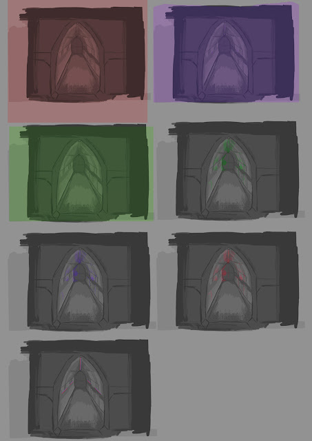
I considered how I could apply this jaw structure, and found an interest approach was to represent the scaffolding as a spine, with a column running through the centre of the ceiling. I felt the most effective, and realistic apporach when considering my modelling abilities in Maya, was the second idea. In the end I went with the very repetitive mathematical approach, but I find it interesting how this was informed by very organic and in some cases wild subject matter. As I was already aware that the colours were mainly going to be dirty low saturated and almost grey, I produced some fast lighting concepts using colour overlay layers in photoshop:
As you can see, I applied some very flooded lights, and some more subtle overlays . I used lots of green both to reflect the exterior of the ship and to also continue this uneasy dingy effect I was trying to achieve with the antagonist's environment. In the end I went with this dingy green approach. In reflection, although I considered the background and archetype of the character who possessed the space, I didn't actually consider including the colours chosen by Dan when choosing them in the environment. Although as it happens the greens work quiet well over the brown and teal chosen by Dan, perhaps it is worth considering the development of my teammate's work alongside my own work when producing collaborative projects. It is quiet easy to veer off on a tangent and find you are all moving in different directions. I will keep this in mind in future and try and maintain better communication with my teammates in relation to ideas and development.
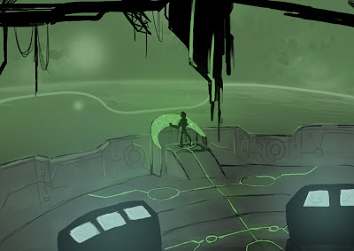
This final piece of concept art was produced simply to give a better idea of the scale of my 'Whale ship'. With the size of the cockpit, one could easily assume that this is a small lightweight craft, whereas I am aiming for a large vessel hosting a maze of corridors. To clear up any potential confusion, I painted the inside of the cockpit. Again, as time was of the essence, I grabbed a space landscape from a web search and dropped it into my image. I am aware of potential copy write issues, which hopefully will not apply as the painting is not for commercial use. I also plan on replacing the backdrop with my own work before uploading it to any media sharing platforms or adding it to my personal portfolio:
Instead of producing technical drawings, I jumped straight in to Unity and blocked out a set. I included the main corridor where the ninja runs past the security camera in the storyboard, the room where the bomb is planted by the ninja and the surveillance room where the guard first catches a glimpse of the ninja.
I colour coded each section to make the plan visually easy to make sense of:
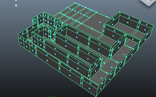
The blue area is where the ninja darts past the corridor. The red is the small camera room where the guard monitors the screens and the green area is the bomb-plant room where most of the character interaction takes place. I took this plan and began creating a very blocky model in maya. I planned to first create the walls and eventually join them with the arches. It was pointed out to me however, that this was a rather inefficient way of working. The walls were looking bare and texturing the whole object would be a very difficult and tedious undertaking. Instead it was suggested that I model required segments to be UV mapped and then eventually slotted together. Bellow is the abandoned first attempt at creating my environment:
This new approach of working with pre-modelled and textured segments is similar to how Bethesda created certain elements of the 'Skyrim' world, as demonstrated by their 'Creation Kit' which offers the tools the developers used, to moders who wish to create their own environments:
It is interesting to see the actual interface Bethesda developers used to create the a Triple-A title. Where I feel it is relevant to me, is when considering tidy organised practice. We see assets grouped with sensible naming conventions, which I imagine would be crucial for a smooth workflow especially on such a large and ambitious game title. Looking at in essence the workspace of a Bethesda game level designer, I feel that although I did organise certain assets into folders, I could have been even more organised with my Unity workspace. If we consider that there were most likely several level designers working on the same project for 'Skyrim', their interface probably had to translate easily between practitioners meaning it could be passed around and tweaked to spread out the workload. Even at our stage, it is important to be thinking about how our Maya project would translate if passed over to an animator. Would they be able to understand the hierarchy and naming conventions, would they be able to break the rig where unlocked attributes are present?
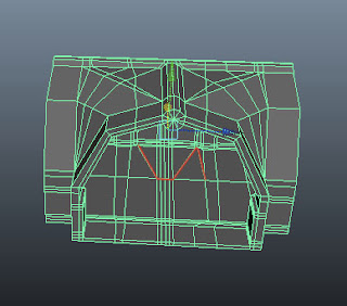
To begin my new direction, I started modelling the straight block, then I took a small segment of this initial model and extruded it into a corner piece. The 'T-block' junction part was a bit more complicated. I began similarly with a small segment as well as a straight corridor piece to lay out the points of the 'T' shape. The process involved a lot of combining geometry, deleting faces, the append to polygon tool and merging edges and vertices. I always like to get into the habit of creating tidy geometry with no faces exceeding 4 vertices. I managed a pretty tidy edge flow with the straight block and corner block, but the T shape got a little bit untidy. Although I didn't exceed my four vertices target, I did have to tie of some of the faces in unorthodox places, ruining the edge flow on some of the edge loops. You can see this from the screenshot below:
As the environment is a rigid asset, how the geometry deformed was never really an issue. Perhaps this is an area I have not visited too much over the module so far, as none of my assets have really required a tidy edge flow. It is however, something I am aware of when rigging and deforming geometry.
After creating door assets and the small security room. At this stage I was pieceing the corridor parts together and takeing them into unity with a first person controller. I now had to think of how the 'bomb plant' area would look. Joel suggested I base it on a piece of his concept work which depicted the ninja character sneaking up toward some kind of generator.
(Work produced by Joel McCuckser)
I liked this idea, so using the T-block piece, I extended a corridor with a small generator room at the end of it. With the environment, I really wanted to take my UV mapping up a level, and eliminate as much stretching as possible. To do this I grabbed a colour coded grid image from our tutor's blog, and applied it to a new lambert texture. After unwrapping the images, I applied the texture, and began tweaking in the UV texture editor window. The idea of efficient UV-mapping is to achieve squares of equal size projected onto your geometry.
As you can see from this original snapshot, the texture is very unevenly stretched over the geometry. To correct this, I had to move the UV points around un the UV window until the texture looked even and tidy. You can clearly see the difference after the process is complete:
After correcting all of the UV maps, I took a snapshot over into Photoshop and applied texture brushes to add a sense of realism to our environment. I set the resolution of the image to 4096 by 4096 pixels to maintain detail in the textures. This is something I began considering when thinking of efficiency when running in a game engine. Smaller assets may only require a 512 by 512 resolution, whereas larger more detailed assets require a higher resolution:
As you can see, In maya the textures appear to stretch nicely over the geometry of the generator asset:
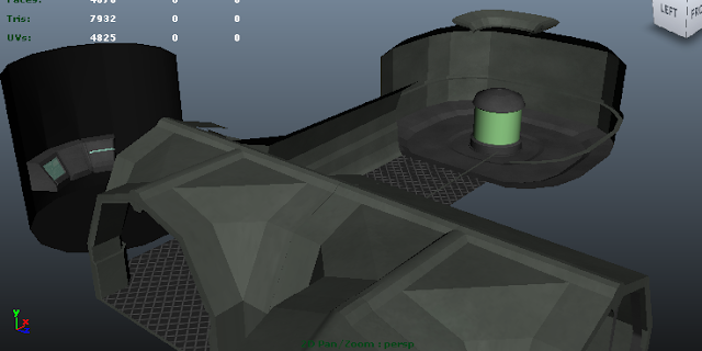
In reflection of the modelling and UV texture phase, I felt I picked up on some useful new skills. To this point I had not considered efficient UV texture mapping, and the results certainly exceed previous textures. The only slight flaw with modelling in segments is that achieving seamless walls and floors as much more difficult. As you can see, the metal mesh floors have seams where blocks are connected. Working in separate Photoshop documents, this would be hard to amend, especially when trying to get the tiles the same size when placed over the geometry. Perhaps if time permitted, I would spend more time trying to make my corridor assets seamless for a more realistic flowing environment.





No comments:
Post a Comment